Page 3 of 10
Re: Invitation to Submit Logo Designs for NAGRI
Posted: Tue Sep 09, 2014 6:12 am
by nagarifle
skeetshot
i will take the knife now if i may, as i do not want to embarrass the others with my art skills.
Re: Invitation to Submit Logo Designs for NAGRI
Posted: Tue Sep 09, 2014 9:20 am
by mundaire
That is indeed a generous offer from NAGRI president skeetshot!

Cheers!
Abhijeet
Re: Invitation to Submit Logo Designs for NAGRI
Posted: Tue Sep 09, 2014 12:10 pm
by nagarifle
sure is a generous offer, many thanks, how about a knife for the worst designed sticker as well skeetshot? lol
Re: Invitation to Submit Logo Designs for NAGRI
Posted: Tue Sep 09, 2014 1:02 pm
by ckkalyan
nagarifle wrote:sure is a generous offer, many thanks, how about a knife for the worst designed sticker as well skeetshot? lol
I think you do have a
point there
nagarifle!

Re: Invitation to Submit Logo Designs for NAGRI
Posted: Tue Sep 09, 2014 3:58 pm
by brihacharan
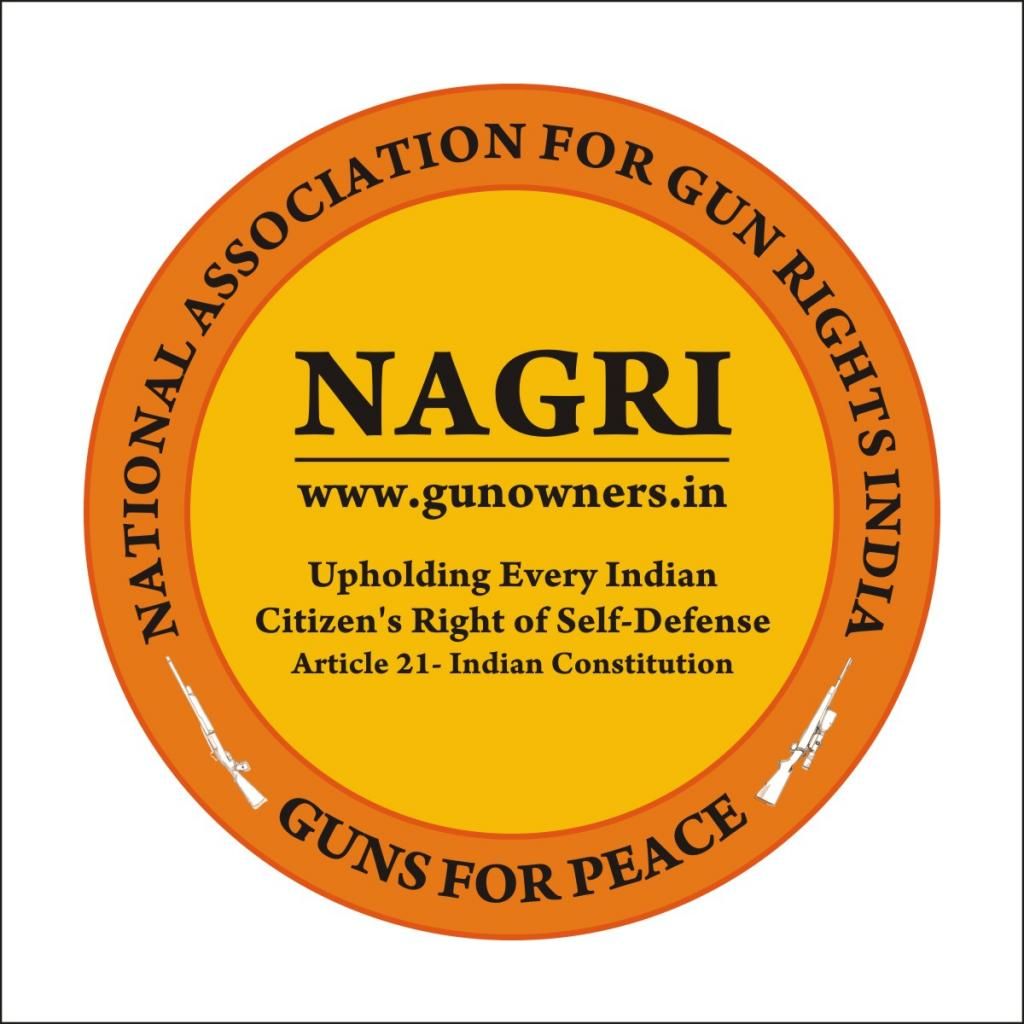
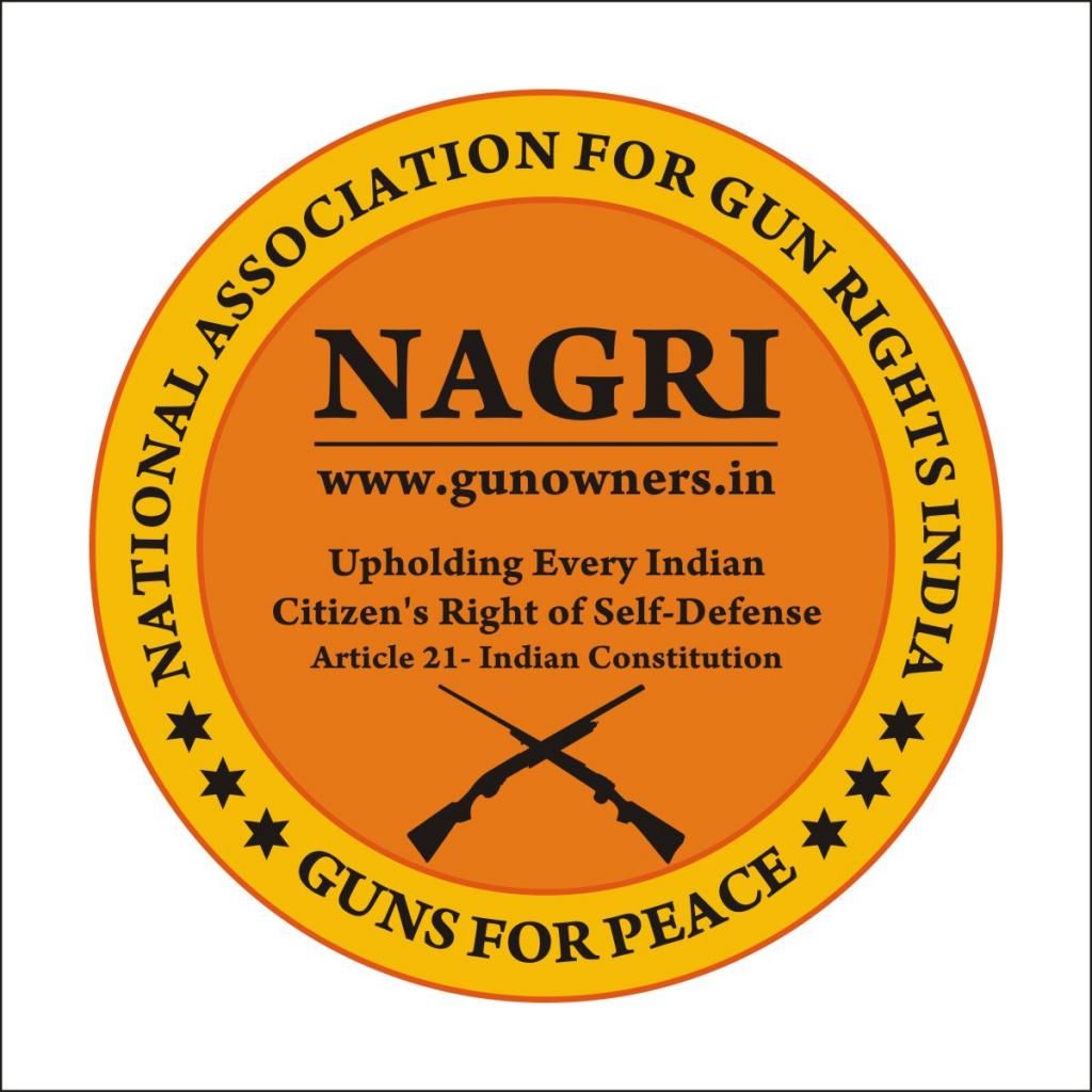
NAGRI LOGO
I’m forwarding herewith a few options for the NAGRI Logo….
While conceptualizing this, the following parameters have been taken into consideration, as is the procedure normally followed while creating Brand Identities.
The logo should have the power to:
ATTRACT ATTENTION - This means that the logo should be unique in appearance to draw attention to it. Create an interest to know more about it…
CREATE AWARENESS / INTEREST - Infuses a sense of awareness that such a thing exists hence wants to know more…
PROMOTE RECALL - Quick response to having seen it earlier….
CALL FOR ACTION - Get inspired to be a part of it to enjoy its benefits…..
Attention to design elements:
CONFIGURATION - The logo appears in a “Circle” – this shape denotes dynamism & continuity…. (The Main Reason, as to why coins are circular in shape – they are meant for circulation) Production wise it can be easily manufactured & can be adapted to Letterheads, Badges, Lapel Pins, Posters, Banners, Car Stickers etc….
COLOURS - The choice of color plays a very important role as colors have the propensity to communicate & infuse emotion & appeal to the senses… Too many colors can confuse & has low recall value. World’s leading Brand Logos are mostly in TWO colors.
Yellow
Cheerful and energetic, it portrays hope, happy times and used to grab one's attention.
Orange
Friendly, inviting, energetic and playful color & is perhaps the favorite of all colors, which is why almost everyone can relate to it in some way or another, especially the youth.
Black
Classic, mysterious, powerful and the most sophisticated shade associated with style, elegance, and taste.
FONTS (size & shape of letters) Have a positive effect in communicating a message – they possess a character that leads to easiness in reading, emotive appeal, recognition & recall.
MAKING A DIFFERENCE –
Here the idea is to make the logo ‘identifiably different’ from others, a distinction that promotes easy acceptance & inculcate the pride of association & ownership…. “Stand-Out” from the clutter… In other words to be SIMPLE & ELEGANT!!!
I do hope that these parameters help in understanding the effort & considerations that has gone behind creating the NAGRI Logo.
Care has been taken to ensure that the ‘Logo’ is not intimidating or outwardly aggressive (because of the sensitivity of the subject) – but elegant enough to state its purpose with genuine concern, appeal, hope & earnestness.
Please notice that the text content “Conveys the Core Purpose, Sentiment & Philosophy” of NAGRI. In short it’s a “Complete Communication Package”!!!
Briha
Re: Invitation to Submit Logo Designs for NAGRI
Posted: Tue Sep 09, 2014 4:47 pm
by nagarifle
nice one uncle ji, like the write up as i got something from it. worth waiting for the gold
Re: Invitation to Submit Logo Designs for NAGRI
Posted: Tue Sep 09, 2014 4:54 pm
by siddikpatel
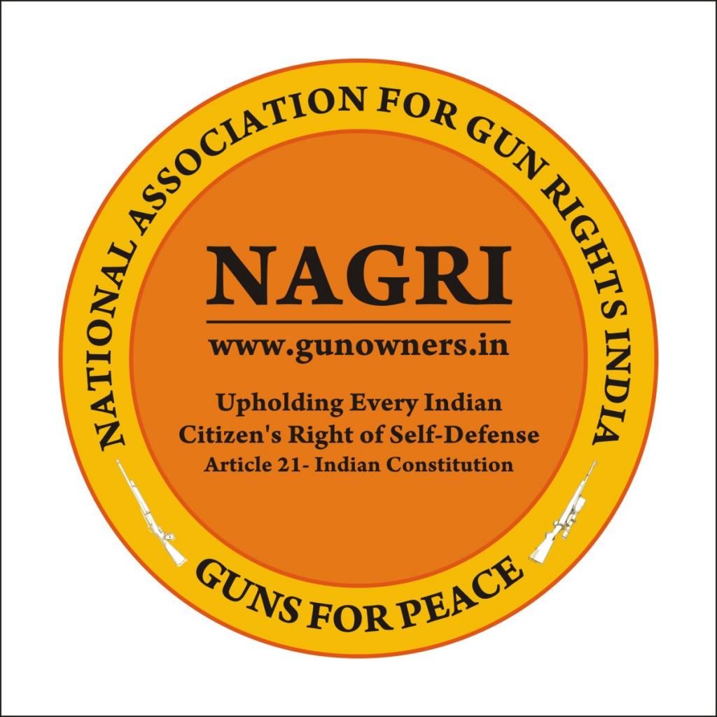
Please check this also...
Re: Invitation to Submit Logo Designs for NAGRI
Posted: Tue Sep 09, 2014 5:19 pm
by brihacharan
nagarifle wrote:
Nice one uncle ji, like the write up as i got something from it. worth waiting for the gold
Hi Nags,
> When something is dear to you - you go all out to come out with the best

> Believe me it's quite a task to create something 'simple' yet 'meaningful'....
Briha
Re: Invitation to Submit Logo Designs for NAGRI
Posted: Tue Sep 09, 2014 5:31 pm
by siddikpatel
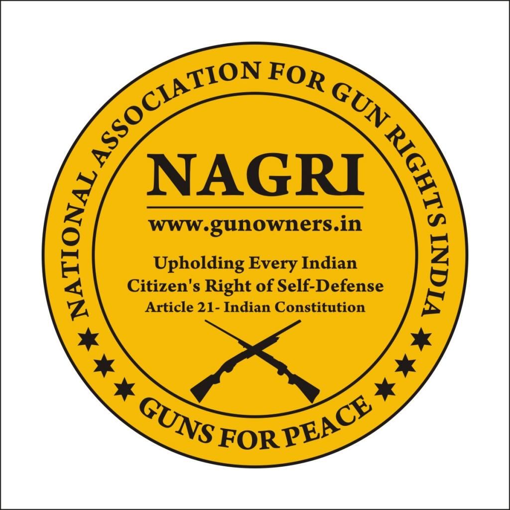
Chang colour.. check this
Re: Invitation to Submit Logo Designs for NAGRI
Posted: Tue Sep 09, 2014 6:47 pm
by nagarifle
its getting better and better

thank God i am not the judge
Re: Invitation to Submit Logo Designs for NAGRI
Posted: Wed Sep 10, 2014 9:17 am
by mundaire
Some great work there gents!
Will try and give detailed feedback by today evening.
Cheers!
Abhijeet
Re: Invitation to Submit Logo Designs for NAGRI
Posted: Wed Sep 10, 2014 9:49 am
by brihacharan
mundaire wrote:
Some great work there gents!
Will try and give detailed feedback by today evening.
Cheers!
Abhijeet
Very encouraging - long Live the "Spirit of NAGRI"

Briha
Re: Invitation to Submit Logo Designs for NAGRI
Posted: Wed Sep 10, 2014 11:11 am
by essdee1972
I am lousy at drawing, in spite of the efforts of my ED teachers. If I may verbalise what I feel........
1. The essence of the NAGRI philosophy is "guns for all", which is contrary to the current limited, rather elitist, gun control regime. Brihaji's logos have the statement "Upholding every Indian's right to self defense", which seems a good statement to make. Emphasising the fact that NAGRI doesn't want just to enhance the rights of current gun owners, but to enable every Indian to exercise his/her right to self-defense.
2. The logo should be expandable, i.e. in case NAGRI wants to make a bumper sticker, say 6" long and 2" high, with the logo at one side, the design should be flexible to allow that to happen. (ref the bumber stickers of team BHP). The longer part might be taken up by some pro-gun quote (by a generally peaceful guy, e.g. Mahatma Gandhi's quote on "depriving an entire nation of its arms"). Or by some thing like "struggling for universal RKBA".
3. A round(ish) logo with "wraparound" text seems the best bet. Apart from what reasons Brihaji has put, a round design also takes care of slight changes in angle while applying. For example, while affixing a bumper sticker, I would be bent over or kneeling on the ground, and may (just may) not be able to stick the logo perfectly aligned to the baseline. In such a case, a round logo would not look off-kilter, while anything in the nature of an angular design would make one say "tedha hai par mera hai"! An ellipse would probably work. A shield shape, tending towards circular, also might do the trick.
4. Colours - should be visible. While a letterhead would be on white / off-white background, hence making most colours visible, a bumper sticker should not be hidden by the colour of the car. Hence colours like red are probably better avoided, esp. towards the edge. Similarly, black, shades of blue or grey, silver, will probably match with a large number of cars in the road.
5. In case NAGRI wants to make a windshield sticker (something like the old PUC stickers, or parking stickers for offices, clubs, and housing complexes) with the glue on the printed side, the colours should be prominent, as stickers in this position are open to fading by the sun.
6. Bumper stickers should be readable by people in other vehicles, while both his and yours are in motion. Hence, a simple design, without too many elements seems desirable.
Just a few ideas for the drawing experts!
Re: Invitation to Submit Logo Designs for NAGRI
Posted: Thu Sep 11, 2014 3:15 pm
by brihacharan
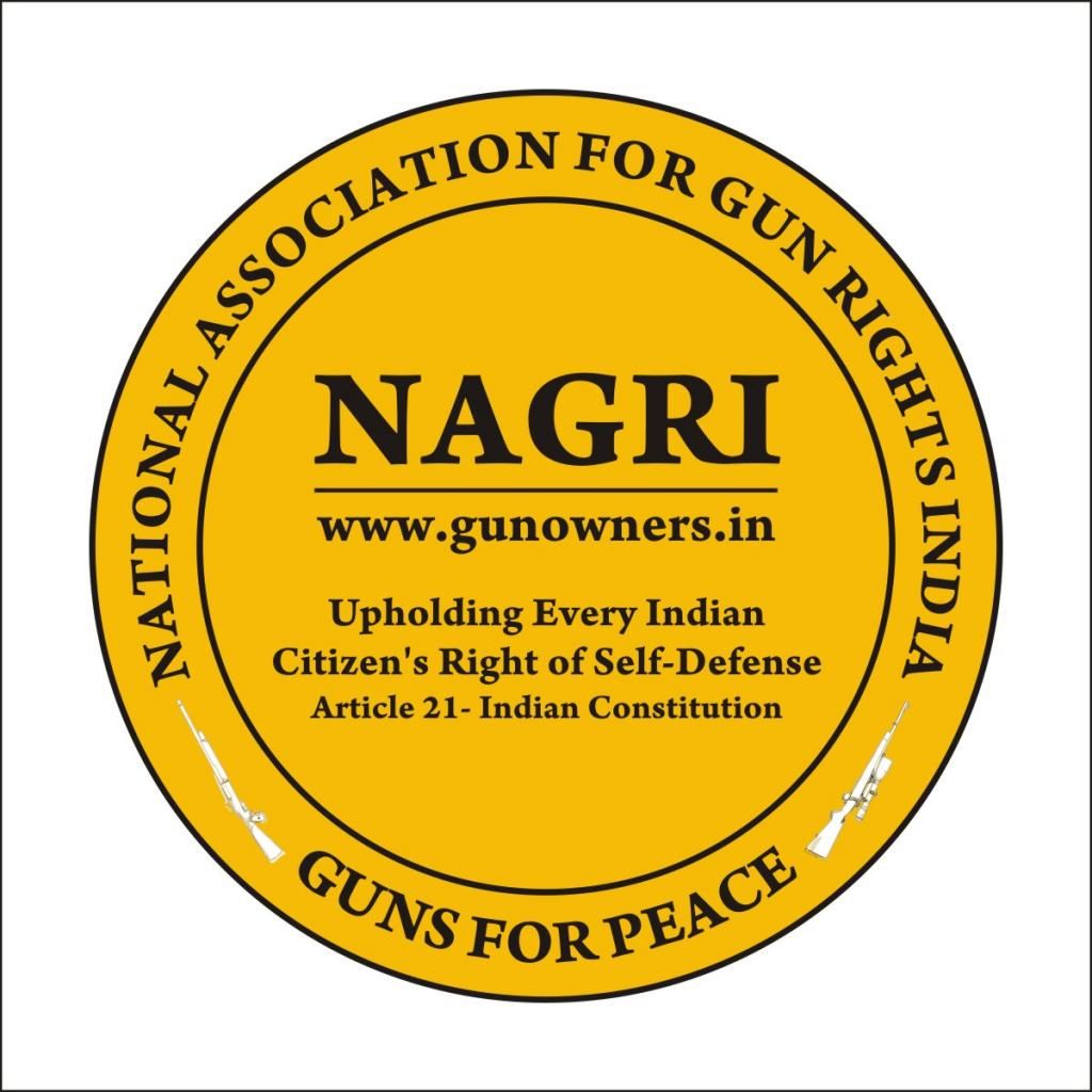
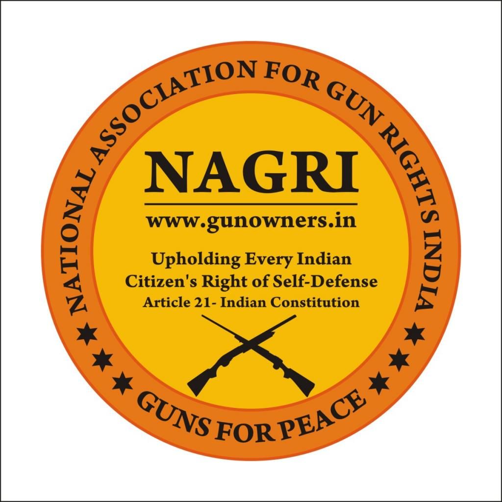
Revised NAGRI Logos
Attached herewith are 3 revised logo options for NAGRI...
The changes incorporated make them look more attractive & dynamic as some elements have been relocated for better clarity & creating a lasting impression.
Briha
Re: Invitation to Submit Logo Designs for NAGRI
Posted: Thu Sep 11, 2014 9:56 pm
by captrakshitsharma
Nice one Briha Ji and Sadik... Working on getting some funds for this job.. Also a windlass officers model khukri to the designer of the new logo from my side....


